STRATEGY · UX/UI · 2022 - PRESENT
stromee Website
The stromee website and electricity marketplace
What started as a simple homepage has grown into a website that has evolved alongside stromee: featuring a redesigned electricity marketplace, a landing page system with custom illustrations, and many new pages, processes, and diverse requirements from partners and new products.
PERIOD
June 2022 - present
TEAM
Sole designer, working closely with Marketing & Development
MY ROLE
Further Development, Design, Implementation & Support
TOOLS
Figma, Storyblok

01 STARTING POINT
When I started at stromee, the website consisted of the homepage, a few landing pages, and the old marketplace. With every new product and every new target audience, the requirements grew: Gas, heating electricity, business rates, and partnerships all needed their own pages—some with new rate calculators—we wanted to showcase our products, create a careers page for job seekers, and address many other requirements.
The website therefore had to be built so that it could grow quickly and consistently.
To do this, I continuously expanded the website with new components. I revised and redesigned the marketplace. I also created new illustrations based on the existing ones and designed and introduced a custom icon system.
02 LANDINGPAGE SYSTEM
The landing pages are created using a modular system in Storyblok. It consists of single and double sections that can be freely combined. I built the landing pages for new products and promotions based on this template. This allowed us to create new pages quickly and consistently. For pages with different requirements, I expanded and customized the system. The next section illustrates this.
Home Page & Plan Landing Pages:
On the home page, visitors learn about stromee: what the concept is all about, what stromee stands for, and what products are available. Anyone interested in a product is directed to the corresponding plan landing page. There, the plan is presented, and users can sign up for it right away.


Landing Pages:
I designed a consistent header for the standard landing pages. To do this, I created matching illustrations based on the existing ones.


stromee Business:
For stromee Business, the core of stromee needed to be preserved. At the same time, the design had to meet the expectations of business customers. I therefore developed a more minimalist version: more subdued colors, no illustrations, and icons adapted to the new context. To ensure the new visual identity is implemented consistently across all pages, I created custom design guidelines for the business segment.
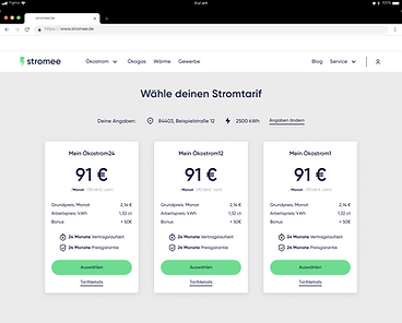
From the business page, a link leads to a dedicated plan selection page. Business customers should have the option to sign up for combo plans. Accordingly, I designed a new sign-up funnel for this purpose.


03 PARTNER DESIGN
One System, Multiple Brands
For partnerships like the one with the soccer club Hertha BSC, I’ve adapted stromee’s basic framework to match the partner’s design. This applies to both the partner landing pages and the marketplace. The structure and features remain the same, while the colors and visual style come from the partner. This allows each partnership to have its own unique presence with minimal effort.


04 ICONS
BEFORE
The icons used up to that point had been created over time for individual landing pages. As a result, they looked quite different from one another: line weights, shapes, and colors often didn't match, and there was no discernible common design language.


AFTER: ICON DESIGN SYSTEM
I developed an icon design system that provides a consistent design language for the entire website. Depending on the purpose, there are four types of icons:
-
Sales icons convey stromee’s core promises—such as sustainable, fair, and innovative. They are framed by a green circle.
-
Simple icons visually support content, such as in navigation, FAQs, or downloads. They are minimalist and have no color accents.
-
Process icons explain workflows step by step. They are more detailed and illustrative. The colored version is intended for stromee B2C, while the monochrome version is for print and stromee Business.
-
Product icons show at a glance which product is being referred to, such as electricity or gas.
The guidelines specify sizes, line weights, spacing, and usage on light and dark backgrounds. Additional “Do’s” and “Don’ts” provide further guidance. This ensures the icons remain consistent everywhere, even when others create new ones.


05 MARKETPLACE
The marketplace is stromee’s unique selling point: It brings electricity to life and gives every kilowatt-hour a face.
The old design didn’t do it justice: The tiles were cluttered, caused confusion, and didn’t work equally well for every producer.
So I redesigned the tiles and created a separate detail page for each producer. Customers can filter by energy type and use the map to find producers in their area. When you flip a tile over, you can see pricing and rate details without leaving the overview. Finally, on the detail page, you get to know the people behind the facility.


OLD TILE DESIGN: WEAKNESSES
Too many elements pop up:
Not only does the tile itself change the view, but sections within the tile also open and close. It’s easy to lose track of where you are.
The tag is on top of the photo:
The energy type and address appear directly on top of the producer’s image and, depending on the subject, obscure important parts of the image.
Data is repeated:
The variable and base rates appear multiple times, making the tile more cluttered than necessary.
Not enough space for the producer:
The information about the producer is crammed into the tile. But the whole point is to get to know the producer and choose them based on that. That requires more space.
NEW MARKETPLACE DESIGN
New tile design:
-
The tile rotates only to show the back or front side
-
The price breakdown is clearly explained
-
The tag for location and energy type does not obscure any important details in the producer's photo

The marketplace and the producer's detail page are separate: On a dedicated detail page, interested users can learn more about the producer through a wealth of information, allowing them to make an even more informed choice.

